Beyond the click

Measuring what actually matters

Most experimentation stops at statistical significance. Declare a winner. Ship it and move on. But how do you know whether that "winner" built something lasting or just manufactured a short-term spike? This is how.

Start here
Illustration for measuring what matters: long-term analytics beyond the click

The framework

Lifetime value, loyalty, and satisfaction: what your testing programme isn't tracking

Conversion rate tells you someone completed an action. These three metrics tell you whether that action was the start of something worth having.

£
01

Lifetime
value

The total revenue a customer generates across their entire relationship with you.

CLV tells you whether your experiments are attracting customers worth keeping. A test that lifts conversion by 5% but brings in people who leave after a month is a net loss. This is the metric that catches that.
02

Loyalty

Whether people come back, buy again, and recommend you to others over time.

Retained customers spend more, cost less to serve, and bring in new business through referrals. Retention curves, NPS, and purchase frequency each measure a different facet of loyalty. Together they tell you whether your customer relationships are deepening or decaying.
03

Satisfaction

How people feel about individual moments: a checkout, a support call, an onboarding flow.

Satisfaction is where loyalty starts. CSAT and CES measure the specific touchpoints that shape whether someone sticks around or quietly leaves. Get the moments right and the relationship follows.
Section break graphic comparing short-term spikes with long-term steady growth

Lifetime value

How to measure customer lifetime value from experiments

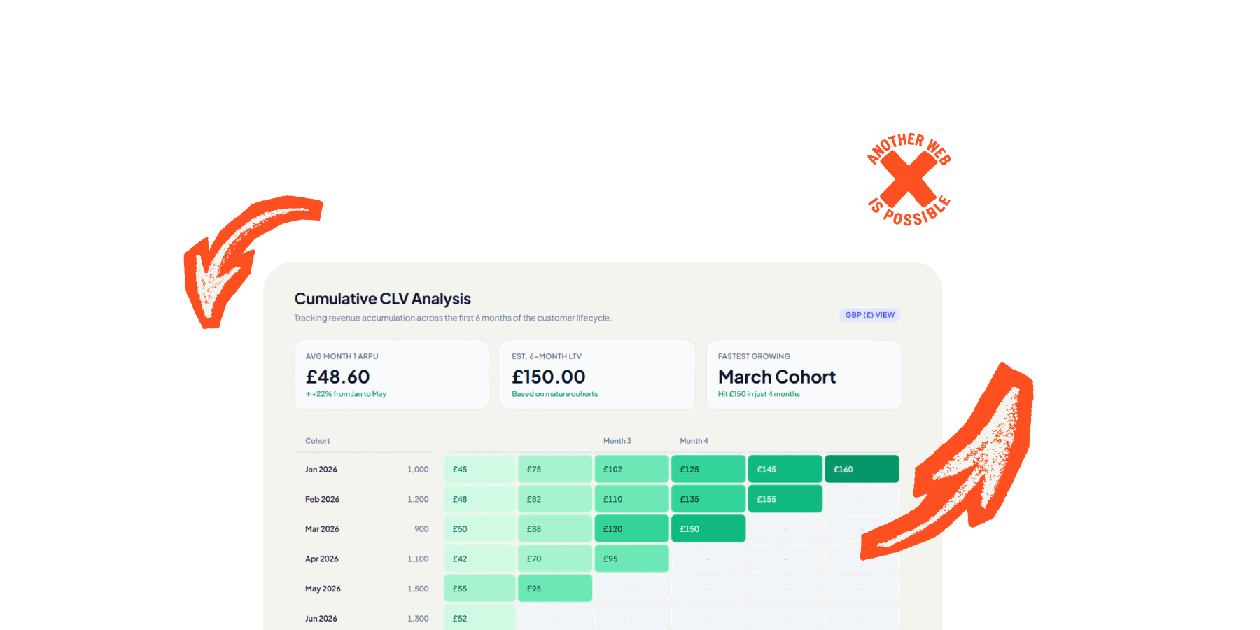
If you're spending more to acquire a customer than they'll ever generate, you need to know that. CLV is the metric that tells you.

Basic CLV
CLV = Avg. transaction value × Transactions per year × Avg. customer lifespan

Simplest model there is. What do they spend on average, how often, and for how long? Multiply those three together and you've got a number. Not a perfect number, but a starting point.

With profit margin
CLV = (Avg. purchase value × Purchase frequency × Lifespan) × Profit margin

Revenue is not profit. A customer generating £1,000 at 25% margin is worth £250 in actual money you get to keep. The margin-adjusted version stops you lying to yourself about what a customer is really worth.

Subscription / SaaS CLV
CLV = (ARPA × Gross margin %) ÷ Revenue churn rate

For subscription businesses, the formula is about how long someone sticks around before they leave. Average revenue per account of £100/month, 80% gross margin, 5% monthly churn? Your CLV is £1,600. That's your ceiling for what each customer relationship is worth.

The ratio that matters here is CLV to CAC (customer acquisition cost). You want roughly 3:1. Below 1:1 means you're paying more to get customers than they'll ever return. That's not growth. That's a bonfire.

Full CLV takes months or years to materialise. You can't wait that long for every experiment. Track these instead. They predict long-term value without making you wait for it.

Bounded LTV windows

LTV7, LTV30, LTV90. Revenue generated within 7, 30, or 90 days of acquisition. LTV7 is a surprisingly strong predictor of full lifetime value. Move first-week revenue and you're almost certainly moving the long-term number too.

Second transaction rate

Percentage of customers who come back and buy again. The second purchase is always the hardest. If an experiment increases repeat buying, it's building genuine value. If it only moves first purchases, it might just be better at persuading people to try something they won't stick with.

Feature adoption depth

How many features someone uses in their first week or month. Deeper adoption correlates strongly with retention and lifetime value, especially in SaaS. Shallow users churn. Embedded users stay.

Support ticket frequency

Inverse indicator. More tickets usually predicts churn. If your experiment boosts conversion but also boosts support load, the short-term win is probably hiding a long-term problem.

CLV calculator

Plug your numbers in. See what a customer is actually worth to you.

Customer lifetime value
£180.00
Revenue (before margin)
£600.00
CLV analysis chart showing customer lifetime value by acquisition cohort over time

Loyalty

Measuring customer loyalty: NPS, RFM, and retention

Conversion rate measures a single action. Loyalty measures whether the relationship behind that action is growing or shrinking.

Net Promoter Score
NPS = % Promoters (9-10) − % Detractors (0-6)

One question: "How likely are you to recommend us to a friend or colleague?" Respondents land in three buckets. Promoters (9-10), Passives (7-8), and Detractors (0-6). Subtract detractors from promoters. That's your score. Range is -100 to +100.

Under 0

More detractors than promoters. Something is fundamentally wrong and you should probably find out what before you run any more experiments.

0 to 30

Solid. Most people are satisfied. Room to improve but the foundations are there.

30 to 70+

Strong to exceptional. Real loyalty, real advocacy. Whatever you're doing, keep doing it.

The follow-up matters more than the score. NPS on its own tells you nothing about why. Always pair it with an open-ended follow-up: "What's the main reason for your score?" The number opens the door. The follow-up is where the useful information actually lives. A score of 35 means nothing without context. A score of 35 with 200 written responses explaining what's wrong is a goldmine.

Consumer brands people have an emotional relationship with. Retail, hospitality, entertainment, consumer tech. People genuinely do recommend restaurants, apps, and shops to their mates. The recommendation question maps onto real behaviour.

B2B SaaS where word-of-mouth matters. If your product spreads through professional networks, NPS tracks something meaningful. Slack, Figma, Notion all grew through recommendations. For products like these, the question isn't hypothetical.

Tracking trends over time, not absolute scores. The number itself is less useful than its direction. Run NPS quarterly, compare it against your release cadence, and watch whether shipping "winners" actually moves the needle. If NPS drops after a batch of experiments went live, those wins were extracting value, not creating it.

Relational NPS, not just transactional. There are two flavours. Relational NPS is a periodic survey (quarterly, biannually) measuring the overall relationship. Transactional NPS fires after a specific interaction. Both are useful but they measure different things. Don't confuse them. A customer can be satisfied with a support interaction (high transactional NPS) whilst being broadly unhappy with the product (low relational NPS).

NPS has a fundamental assumption baked into it: that recommendation is a meaningful measure of loyalty. For a lot of industries, it isn't. Not because the product is bad, but because the act of recommending it would be weird, inappropriate, or socially impossible.

Private or sensitive services. Healthcare, mental health, sexual health, fertility treatment, debt management, legal services, funeral directors. Nobody recommends their therapist at a dinner party. Nobody posts about their bankruptcy solicitor on LinkedIn. A low NPS here doesn't mean dissatisfaction. It means people don't talk about you, and that's perfectly normal. Using NPS as a KPI in these sectors is measuring the wrong thing and drawing the wrong conclusions from it.

Utilitarian products people don't think about. Operating systems, payroll software, hosting providers, utilities, insurance, accounting tools. These are things people use because they have to, not because they love them. Nobody recommends their broadband provider. Nobody evangelises their tax software. CES (effort score) is almost always a better metric here. People don't need to love you. They need you to not be a pain in the arse.

Low-choice or employer-mandated products. If your company chose Salesforce, it doesn't matter how you feel about it. You're using it. Asking whether you'd "recommend" something you had no say in choosing tells you about the product, maybe, but tells you nothing about loyalty because loyalty implies the option to leave. In these situations, track adoption depth and task completion instead.

Culturally variable contexts. NPS thresholds were designed with US/Western response patterns in mind. In some cultures, giving a 10 out of 10 is considered excessive or arrogant. In others, anything below 8 feels rude. If you operate internationally, comparing raw NPS across markets is comparing different scales. You need to benchmark regionally or the data is misleading.

The stated vs actual behaviour gap. Saying "I would recommend you" and actually recommending you are different things. NPS measures intent, not action. Someone might score you a 9 and never mention you to anyone. Someone might score you a 6 and tell three colleagues about you because they needed to vent. If you want to measure actual recommendation, track referral codes, shared links, or ask "have you recommended us in the last 3 months?" instead of "would you."

Don't ask too often. Quarterly for relational NPS is the sweet spot. Monthly is too frequent and you'll fatigue respondents, tank your response rate, and start getting noise instead of signal. If you need more frequent feedback, use CSAT on specific touchpoints instead.

Don't ask at emotionally loaded moments. Right after a support ticket is resolved, people either feel grateful (inflated score) or still annoyed (deflated score). Neither is representative. For relational NPS, trigger it at a neutral point in the customer journey, not during or immediately after a charged interaction.

Segment the results. Overall NPS is a vanity metric. What matters is NPS by customer tenure, by value tier, by acquisition channel, by experiment cohort. New customers vs customers who've been with you two years will have completely different scores. High-value vs low-value customers will too. The segments are where the insight lives.

Separate the score from the follow-up in your analysis. The quantitative score tells you the direction. The qualitative follow-up tells you what to do about it. Read every single open-ended response. Code them into themes. The themes are your roadmap. Most companies look at the number and ignore the text. That's like reading the headline and skipping the article.

Close the loop. If someone gives you a 3 and explains why, respond to them. Not with a template. Actually respond. Detractors who feel heard sometimes become promoters. Detractors who feel ignored become ex-customers who tell everyone they know.

RFM (Recency, Frequency, Monetary) segments customers by what they actually do rather than what they say they'll do. No surveys. No response bias. Just behaviour.

Recency

How recently they bought something. More recent means more engaged. Score 1-5, with 5 being the most recent.

Frequency

How often they buy. Higher frequency signals deeper loyalty and habit. A repeat customer is worth far more than someone who bought once and disappeared.

Monetary

How much they spend. Combined with frequency, this tells you whether they're spending more or less over time. Trajectory matters more than the absolute number.

Combine the three scores for segments like Champions (5-5-5), At Risk, or Lost. Shopify, Klaviyo, and Optimove calculate this automatically. Or do it yourself in a spreadsheet. For digital products where spend isn't the main metric, swap Monetary for Engagement (RFE model) and track session depth, features used, or pages viewed instead.

Retention curves are the most honest picture of product health you can get. Group users into cohorts by when they signed up, then track what percentage are still active at Day 7, 30, 60, 90, 180, 365.

The shape tells you everything. A sharp initial drop followed by a plateau? Good. Users who survive the first week tend to stick. A curve that just keeps declining and never flattens? You haven't found a floor of genuinely engaged users yet. That's the problem to solve before you optimise anything else.

Retention curve chart comparing healthy and declining user cohorts over time

The 5% rule

Bain & Company found that improving retention by just 5% can lift profit by 25-95%. Small retention gains compound massively. This is why long-term measurement matters more than whatever your last A/B test did to conversion rate this week.

Amplitude and Mixpanel handle advanced cohort retention analysis well. GA4 does the basics but falls over on multi-criteria cohorting. For full control, export to BigQuery and join product data with CRM and payment data in SQL.

Satisfaction

CSAT, CES, and NPS: measuring satisfaction at each touchpoint

NPS gives you the big picture. These three metrics tell you what's happening in the moments that make or break the relationship.

CSAT CES NPS
Measures Satisfaction with a specific interaction How easy it was to do something Overall loyalty and recommendation
Time horizon Immediate, transactional Immediate, operational Long-term, relational
Best used After purchases, support, updates After checkout, onboarding, support Quarterly, before/after big changes
Key insight Which touchpoints are failing Better loyalty predictor than CSAT Brand health over time

They work together. NPS tells you the relationship is suffering. CSAT tells you which touchpoint caused it. CES tells you whether the problem is the thing itself or how hard it is to use. Low NPS plus high effort score? The issue is friction, not product quality. Fix the journey before you fix the features.

  • CSAT per variant. Fire a CSAT survey only at users in your test variant. Compare against control. Conversion went up but satisfaction went down? You've probably built a dark pattern, not an improvement. This is the check most programmes never bother with.
  • CES for process changes. Testing a new checkout flow or onboarding sequence? CES tells you whether it's genuinely easier or just different. Lower effort plus higher conversion is the gold standard. Higher conversion plus higher effort is a warning sign.
  • NPS across releases. Run NPS quarterly. Compare the trend against your shipping cadence. If NPS drops after a batch of "winning" experiments went live, those wins were extracting value, not creating it. The numbers were up but the experience was worse.
Measurement infrastructure: systems and data flow for long-term analytics

How to actually do this

Holdout groups, cohort analysis, and other long-term methods

You can't measure lifetime value with a two-week test. Here's how to bridge the gap between how long experiments run and how long impact actually takes to show up.

Take a small percentage of users (typically 2-5%) and exclude them from all product changes for a sustained period. Usually a quarter or six months. They see the site as it was at the start. Everyone else gets every experiment, every winner, every change. Then you compare. That's your answer to "did all this testing actually do anything?"

Facebook and Twitter ran 6-month holdouts on 5% or less of traffic. Used the cumulative comparison to evaluate whether their entire product direction was working. The holdout measures everything: the wins, the losses, and the interaction effects between them that individual test results can't capture.

  • Three types. Experiment holdouts reverse-test a single experiment after it concludes. Feature holdouts hold back a bundle of related changes. Global holdouts shield a group from everything. Global is the most powerful but the hardest to maintain.
  • What works. Keep the group small. Run for defined periods, then release and restart. Track durable outcomes (revenue, retention, engagement) rather than vanity metrics. Rotate users periodically so nobody's stuck on a worse experience forever. Use feature flags for clean separation.
  • Platforms that support this natively: Optimizely, GrowthBook, PostHog, Statsig, Eppo, AB Tasty.

Group users by when they arrived (or by which experiment variant they saw) and track their behaviour over time. Are the users from Variant B still outperforming control at Day 90? Or did the lift vanish once the novelty wore off?

This is the simplest long-term measurement technique and probably the one you should start with. Tag experiment exposure as a user property in your analytics platform. Then you can segment retention, CLV, survey scores, anything, by which variant someone saw. Even months later.

Multi-criteria cohorts go deeper. Instead of just "signed up this week," you define "signed up this week AND completed onboarding AND made first purchase within 3 days." Amplitude and Mixpanel support this natively. GA4 needs BigQuery export for anything beyond the basics.

The question to keep asking: are newer cohorts more valuable than older ones? If your product is genuinely improving, newer cohorts should have better retention. If they don't, your experiments might be optimising the wrong things.

Sometimes the simplest answer is the right one. If you're worried about long-term effects, don't declare a winner at two weeks and move on. Run the test for six to eight weeks instead.

Longer tests catch novelty effects (people reacting to something new rather than something better), regression to the mean, and seasonal patterns that a short window misses completely.

Pinterest found that an initial 7% lift from a push notification change faded to 2.5% over a year. Still positive, but less than half the forecasted impact. Without extended measurement they'd have massively overestimated the value. That overestimation compounds across dozens of tests per quarter.

The foundational pattern. Send the experiment variant ID to your analytics platform as a user property. Once it's attached to the user, you can filter any report by experiment exposure. Retention, CLV, survey results, support tickets. Even months after the test has stopped running.

Most testing tools can push this to GA4, Amplitude, or Mixpanel via data layer events, webhooks, or native integrations. Convert does this natively. So does Optimizely. AB Tasty has a clean integration with Hotjar that lets you filter heatmaps and recordings by campaign.

Without this, your experiment data dies when the test stops running. With it, the data lives as long as the user does. This is the single most important integration to get right.


Build your stack

Choosing your measurement and experimentation tools

Pick your situation below. The recommendation covers four layers: analytics, experimentation, qualitative feedback, and customer data. Each tool is assessed for capability and for how it handles your users' data.

What best describes your business?

E-commerce
Selling products online
SaaS / Subscription
Recurring revenue
Content / Media
Engagement-driven
B2B / Services
Longer sales cycles

What's your budget?

Bootstrap
Free or cheap only
Mid-market
Some paid tools
Enterprise
Full investment

What's your team like?

Solo / Small
No dedicated analysts
Growing
Some data capability
Mature
Dedicated data team

How much do you care about privacy and data ownership?

Pragmatic
Best tool for the job
Considered
Prefer ethical where possible
Non-negotiable
Open source or privacy-first only
Connecting experimentation, analytics, and feedback tools into one measurement stack

Wiring it up

How to connect your experimentation and analytics stack

Individual tools do nothing useful in isolation. Here's how to connect them so experiment data flows into long-term measurement.

Experiment
platform
Variant ID as
user property
Analytics
platform
Cohort / CLV
analysis

Survey per variant

Fire NPS, CSAT, or CES surveys only at users in specific experiment variants. Compare satisfaction between control and treatment. Hotjar triggers surveys via custom events tied to variants. Qualaroo and Pendo can target by URL parameters or feature flag state. This is how you catch dark patterns before they ship.

Warehouse-native analysis

Export experiment assignments and behavioural data to BigQuery, Snowflake, or Redshift. Run SQL joining experiment exposure to CLV, retention, and satisfaction over any time horizon you like. Eppo and GrowthBook are built for exactly this pattern. Maximum flexibility, maximum control.

This goes deeper than the metrics

If your experimentation programme only measures short-term conversion, you're implicitly saying you don't care whether changes help or harm users over time. That's a choice. Most companies don't realise they're making it.

Long-term measurement is a built-in check against manipulation. Track satisfaction alongside conversion and you'll see when a "winning" variant wins because it made things harder to refuse, not better to use. Track CLV alongside acquisition and you'll notice when aggressive tactics bring in people who'll be gone in a month. The tools aren't neutral. What you choose to measure shapes what you choose to build.

Need help? Let's talk