This is what not to do

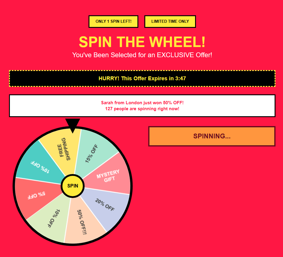
Nothing screams 'trust us' like a rigged slot machine the moment someone visits your site. This predatory popup exploits gambling psychology to extract personal data in exchange for a 'prize' so worthless it requires a £500 spend.
Spoiler: it always lands on 10% off

The guides visitors through six stages of a typical user journey with fictional product "[Product Name]"
It presents a realistic and detailed walkthrough of six common deceptive patterns used by SaaS products and subscription services to trap users and artificially extend retention.

You signed up for a product. It took 45 seconds. The UI was clean, the flow was smooth, and you didn't notice a thing. That was the whole point.
By the time you hit "Get Started," you'd handed over nine separate marketing permissions without giving informed consent to any of them. Pre-checked boxes, hidden text, trick questions, inverted defaults, and a legitimate interest clause designed to make you think you had no choice. This is how consent gets manufactured at scale.
.png)
The product was £29.99. By the time you reached the payment screen, it was £47.83. You didn't add anything. They just hadn't finished telling you the price yet.
Delivery, handling, packaging protection, service charge, card processing. Each one small enough to feel trivial. All of them hidden until you'd already entered your address and card details.
These are the creeping costs of drip pricing. It works because once you've invested the time, walking away feels like losing. The house always wins.

Spotted something shady in the wild?
We're building the internet's definitive collection of manipulative design patterns, and we need your help.
If you've encountered a particularly egregious example of deceptive design whether it's a popup from hell, a cancellation flow that makes you question reality, or a pricing page that would make a magician jealous we want to hear about it!
What we're looking for:
Real examples of design patterns that prioritise business metrics over user wellbeing.
The kind of stuff that makes you feel manipulated, confused, or trapped. Bonus points if it made you audibly say "are you kidding me?"
What happens next:
We'll review your submission, investigate the pattern, document the specific manipulation tactics at play, and (if it's sufficiently shameful) immortalize it in our Hall of Shame.
Every entry helps other designers, product teams, and businesses understand what not to do.
Submit your evidence below screenshots encouraged, rants welcomed.
